How to Choose a Wedding Color Palette for Handmade Decor
Build a four-color craft palette with a main color, a partner, a neutral and an accent, then turn it into cardstock, ribbon and flowers with a swatch card of real samples.
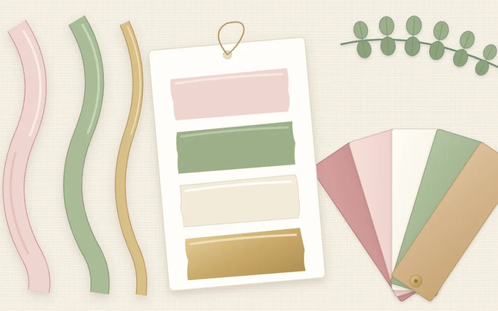
Handmade pieces look coordinated when their colors repeat, not when every item is elaborate. A plain kraft tag and a simple ribbon bow in the same four colors as the table numbers will read as one set from across the room.
That is the whole job of a wedding color palette for crafts: a short list of colors, fixed early, that you check every sheet of cardstock and every roll of ribbon against. This guide shows how to build one, turn it into real materials and avoid the common mismatches.
Build the palette from four roles
Four colors are enough for almost any set of handmade decor. Give each one a job.
- Main color: the one people will name when they describe the decor, such as blush or dusty blue.
- Supporting color: a partner that sits comfortably beside the main color, often a green or a deeper shade.
- Neutral: ivory, white, kraft or gray. It is the background for lettering and the bulk of your cardstock.
- Accent: a small amount of something stronger or shinier, such as gold, copper or a dark tone.
A fifth color is where sets start to look busy. If you want more variety, add a lighter or darker version of a color you already have.
Use the colors in unequal amounts
Equal amounts of four colors compete with each other. A rough 60/30/10 split is easier on the eye: the neutral and the main color together make up about 60 percent of what guests see, the supporting color about 30 percent, and the accent about 10 percent.
You do not need to measure this. Look at one finished table setting and ask which color you notice first. If it is the accent, there is too much of it.
Borrow three ideas from the color wheel
You can pick colors by instinct, but the color wheel explains why some pairs work, and it helps when you are stuck.
- Neighbors for a soft look. Colors that sit next to each other on the wheel, such as pink, peach and coral, blend gently. Add a neutral so the result does not turn flat.
- Opposites for contrast. Colors across the wheel make each other look brighter: pink beside green, blue beside orange. Soften one of the two and use far less of the other. Blush with sage is a quiet version of red with green.
- Tints of one hue for an elegant monochrome. Take one color and use it pale, medium and deep, with a neutral and a metallic accent. This is the hardest scheme to get wrong.
Four example palettes
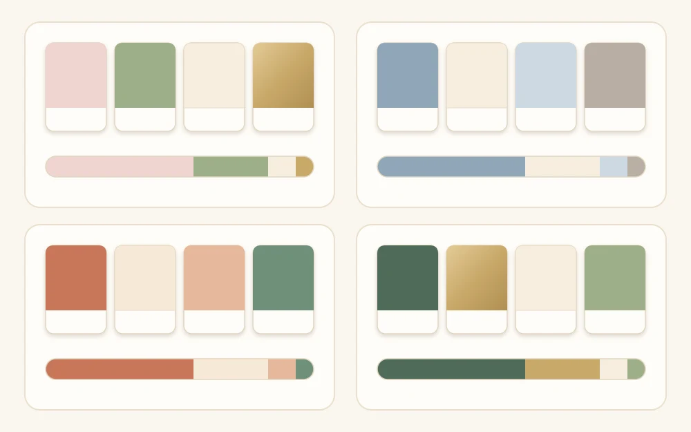
Blush and sage
Blush as the main color, sage as its partner, ivory as the neutral and soft gold as the accent. It suits lace, satin ribbon and eucalyptus, and it works in any season.
Dusty blue and ivory
Dusty blue with a deeper slate blue, ivory, and silver or pale gray as the accent. This is a tints-of-one-hue scheme that looks crisp on white cardstock with dark blue lettering.
Terracotta and cream
Terracotta with a muted peach, cream and kraft together as the neutral, and a touch of copper. Twine, wood and dried grasses fit in without effort. It leans naturally toward autumn, and there are projects in these tones among the fall wedding crafts.
Deep green and gold
Deep green with a lighter moss green, ivory, and gold as the accent. Velvet ribbon and evergreen sprigs carry it well, which makes it a natural base for winter wedding crafts.
Translate the palette into materials
A color looks different on every surface. Satin reflects light and appears paler, velvet appears deeper, and kraft paper warms whatever sits on it. Decide which material carries which role.
- Cardstock: mostly the neutral, with the main color for mats, layers and tags.
- Ribbon: the main and supporting colors, in two widths. Ribbon is the easiest place to add color in small doses.
- Fabric: the neutral for runners and backdrops, with strips of the main color.
- Flowers and greenery: greenery often is the supporting color. Count it as part of the palette instead of adding a second green. The same goes for the blooms in your handmade centerpieces.
- Wood and twine: these count as neutrals. If you use a lot of them, choose kraft or cream cardstock over bright white.
- Metallics: one metal only. Mixing gold and silver across the room looks accidental.
Make a swatch card of real samples
Screens show colors with light, and every screen shows them differently. Dye lots also vary, so two rolls of ribbon with the same color name can differ visibly. A swatch card of real samples is the only reliable reference.
- Cut a piece of white cardstock about 3 x 5 in (7.5 x 13 cm), small enough for a bag or pocket.
- Glue or staple on a snippet of each chosen material: a strip of each cardstock, about 2 in (5 cm) of each ribbon, a scrap of fabric.
- Paint a small bar of any paint or ink color you plan to use and let it dry, since wet paint looks different.
- Write the role next to each sample: main, supporting, neutral, accent.
- Make a second card to keep at your work table.
Tip
When a color has to match exactly, get all of that ribbon or cardstock in one go, with spares. A later batch may come from a different dye lot and sit slightly off beside the first.
Check the colors in the light they will be seen in
Hold the swatch card near a window in daylight, then under a warm lamp in the evening. Warm indoor light pushes blush toward peach, makes ivory look yellow and dulls blues and cool greens. Daylight does the opposite and can make pale colors wash out.
If the pieces will be used indoors in the evening, judge them under warm light. If two colors merge there, deepen one of them.
Keep to the palette while you work
Most mismatches come from an impulse purchase halfway through, not from the original plan. Carry the swatch card, hold every new material against it, and leave behind anything that needs a new color to make sense.
If you have not yet decided what to make, the guide to wedding crafts for beginners helps you narrow the list to a few projects, which is also the easiest way to keep the colors under control.
Frequently asked questions
How many colors should a wedding color palette have?
Four is a practical number for handmade decor: a main color, a supporting color, a neutral and one accent or metallic. Fewer can look plain across a whole room, and more than five makes it hard for separate pieces to read as a set. Lighter and darker versions of a chosen color add variety without adding a new hue.
Does greenery count as one of the palette colors?
Yes. Eucalyptus, ferns and other foliage cover a lot of visible space, so their green behaves like any other color in the scheme. Treat it as the supporting color where it fits, and choose ribbon and cardstock greens that sit close to the real leaves you plan to use.
Why do my ribbon and cardstock look different even though both are called blush?
Color names are not standardized, and shiny, matte and textured surfaces reflect light differently. Satin tends to look paler than matte cardstock in the same shade. Compare real samples side by side, in daylight and under warm indoor light, and accept a close relative instead of chasing an exact match.